Stripes or Blocks: Two Ways to Separate Team Colours
Compare striped and solid-color team shirts by pattern rhythm, panel placement, and motion to choose a design that stays coherent and recognizable in play.
Will stripes or solid blocks make your team shirt’s design easier to recognize? Start by looking at the pattern itself: stripes repeat across the body, while blocks divide it into larger shapes. That choice affects the shirt’s rhythm, how its panels meet, and whether its design still feels intentional as players move.
Choose a pattern with a clear visual lead
A shirt can carry several design elements, but one should lead. Stripes can establish the main pattern across the torso; solid blocks can make a larger body area feel calm and unified. A contrasting collar, sleeve, badge, and sponsor mark may all be useful, yet together they can compete with the central design.
Sketch both approaches using the same garment outline and the same required marks. In the striped version, keep the body pattern as the main feature and treat sleeves or collar as supporting details. In the block version, let one broad area dominate and use a smaller panel to direct attention rather than adding another equally strong division.
Use stripe direction and spacing deliberately
Vertical stripes create a lengthwise rhythm; horizontal stripes create a crosswise one. Angled bands can suggest movement, but they also make seams and panel joins more noticeable. No direction is automatically clearer. The pattern works when its repetition remains apparent on the whole shirt rather than breaking into unrelated fragments.
Spacing matters as much as direction. Closely packed narrow bands may read as a single textured area at a distance, while broader bands make the alternation easier to see. On a digital mock-up, zoom out to the size of a small shirt on screen. If the stripes merge, simplify their spacing or use fewer, broader bands.
Check how the bands meet at the collar, sleeves, and side seams. A stripe that stops at a seam can look purposeful if the next panel carries a matching line or a clean boundary. If it ends without a visual reason, the shirt may look like separate pieces rather than one considered design.
Let blocks follow the garment’s shape
Color blocks can use a yoke, sleeve, side panel, or lower panel to organize the shirt. A shoulder yoke frames the upper body; a side panel emphasizes the garment’s outline; a sleeve block adds contrast without dividing the main torso. Choose panel placements that remain visible from more than one angle.
Small accents can disappear in a full-body view, while too many large panels can make the design feel patchwork-like. Keep a front, back, and side drawing beside one another as you adjust the shapes. If a panel appears only from the front, decide whether that is intentional or whether it should continue around the body.
Check the design while the shirt is moving
Players turn, raise their arms, and overlap one another. A stripe may be interrupted by a fold or hidden beneath an arm; a side block may vanish when the player faces forward. A flat front view cannot reveal every such change, so compare the full garment from several angles.
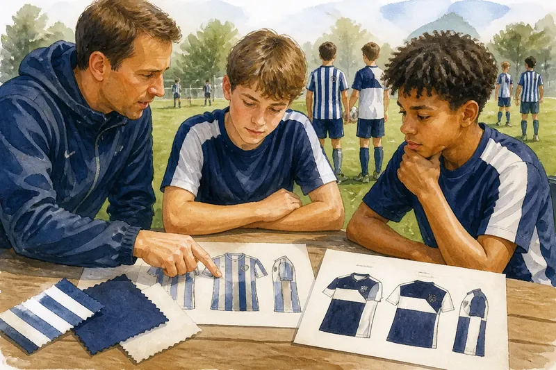
Say a youth team has a mock-up with narrow diagonal stripes across the body, plain sleeves, and a badge near the chest. The coach notices that the stripes look like one busy area in the small preview. They widen the bands, keep the sleeves plain, and view front, back, and side drawings at reduced size. The expected result is a more legible repeating pattern; the tradeoff is that fewer bands fit across the torso.
A useful review can happen with paper printouts, a colored shirt template in Google Slides, or a fabric swatch from the supplier. Turn the drawing, view it from across a room, and note what reads first: the stripes, a large panel, or the badge. If the answer changes sharply between views, simplify the element that keeps interrupting the main pattern.
How should you compare stripes and blocks?
Do narrow stripes work on a team shirt?
They can, but closely spaced bands may merge into a textured area when viewed small or from farther away. Check them on a reduced-size mock-up and widen or simplify the pattern if the alternation disappears.
Can stripes and blocks appear in one design?
Yes, as long as one pattern leads and the other supports it. A striped body with plain sleeves, for instance, keeps the body’s rhythm prominent without asking another pattern to compete.
How can I check whether a pattern works from different angles?
Draw or print the front, back, and sides, then turn the mock-up or ask someone to hold it while you view it from different positions. Note whether the same main pattern remains recognizable and revise panels that seem to stop or shift without purpose.
What should I send a shirt supplier?
Share the final front, back, and side artwork, including panel boundaries, stripe direction, and the placement of badges or lettering. Ask the supplier to confirm how the design will be applied to the chosen fabric and follow any team or competition kit rules that apply.
Use a short review before choosing a pattern
- Check whether the torso has one dominant pattern; if stripes and panels compete, simplify one, or keep the stronger design and remove the other.
- Check whether stripes remain distinct on a reduced-size mock-up; if they merge, widen the bands, or replace them with broader blocks.
- Check whether stripe lines meet seams cleanly; if they stop awkwardly, adjust the alignment, or end them deliberately at a plain panel.
- Check whether a color block remains visible from the front and side; if it disappears at an angle, extend or reposition it, or use a front-facing panel instead.
- Check whether the badge and sponsor mark interrupt the main pattern; if they do, move them to a quieter area, or reduce the surrounding pattern’s complexity.
- Check whether the front, back, and sides share a coherent design; if one view feels unrelated, carry a shape or stripe across the panel, or simplify that section.
- Check the supplier’s fabric and application guidance against the approved artwork; if a detail cannot be produced as drawn, revise the artwork, or choose a simpler panel or stripe treatment.
For a final choice between stripes or blocks, favor the design whose pattern remains coherent across the whole shirt and while the wearer moves. A few deliberate stripes or panels usually give badges, lettering, and the garment’s shape room to be seen without sacrificing a distinctive team design.